Data Science Portfolio Projects (Part II)
Introduction
Welcome back to the second installment of our series on crafting and deploying engaging data science projects! In the previous post, we embarked on a journey to create static web applications that seamlessly integrate Python and JavaScript, making them accessible, user-friendly, and, most importantly, cost-effective to host. This approach not only elevates your project’s visibility but also circumvents the common hurdles of server costs and complex backend requirements.
The focus of this tutorial is to guide you through the process of setting up a custom domain name for your project and running a semi real application. We’ll walk you through each step, from selecting and purchasing a domain on Squarespace to configuring the DNS settings to align with GitHub.
In addition to the technical setup, we’re taking a significant leap in the aesthetic and functional aspects of our web app. Say goodbye to basic text elements, as we introduce Tailwind CSS into our toolkit. This will transform our simple interface into a visually appealing and user-friendly platform. Our goal is to demonstrate that the final touches, often deemed as less thrilling, are vital in elevating a project from good to great.
As we proceed, remember that the beauty of these projects lies not only in their technical prowess but also in their accessibility and usability. By the end of this tutorial, you’ll have a sophisticated web application that’s not just a demonstration of your data science skills but also a testament to your ability to create a complete, user-centric project. Let’s dive in and bring this vision to life!
The website we are building can be found at:
https://easydatasciencewebapps.com/
All code for this project is located on Github here:
https://github.com/nbertagnolli/easy-static-datascience-webapp
Appeal to Reader
If you pay for Medium, or haven’t used your free articles for this month, please consider reading this article there. I post all of my articles here for free so everyone can access them, but I also like beer and Medium is a good way to collect some beer money : ). So please consider buying me a beer by reading this article on Medium.
Setting up a custom domain name
To start we’ll need to buy a domain and setup the DNS. I’m using SquareSpace because they just bought GoogleDomains which was my favorit RIP. :(. Go to SquareSpace and search for a domain for your application.
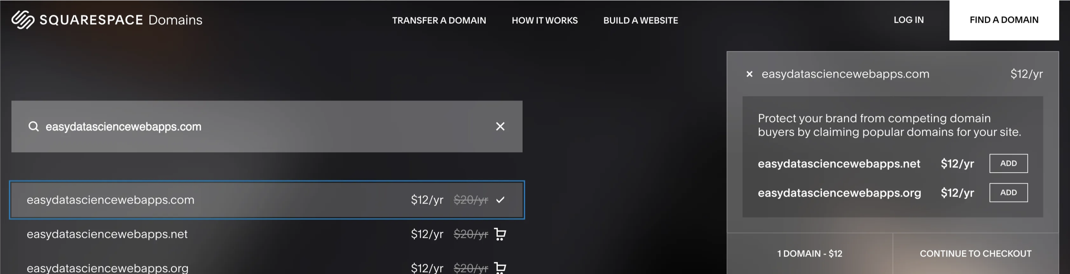
Follow the payment options and purchase the domain you’d like to use.
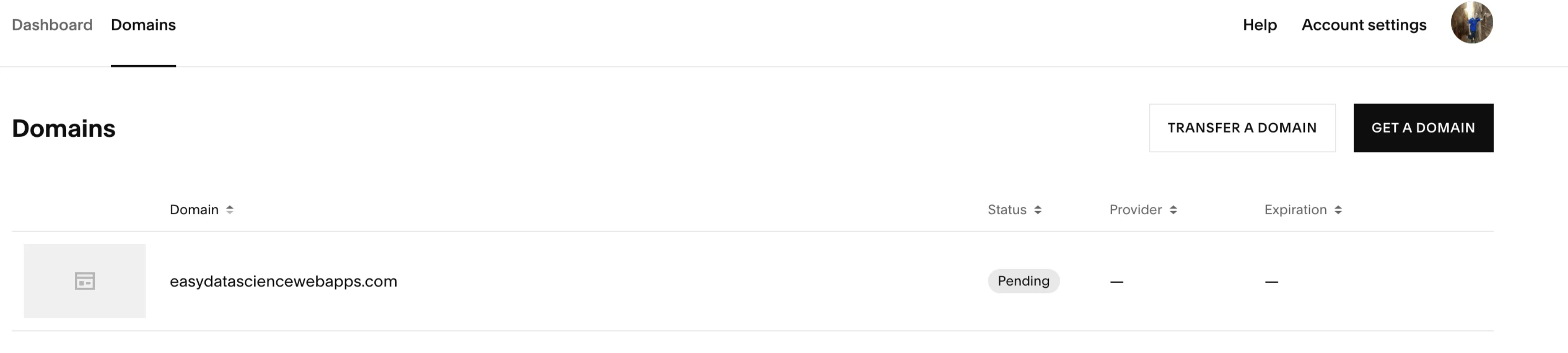
Once you’ve bought a domain, click on the domain and choose to manage domain. Then in the top right you can select Edit DNS.
Here is where we have some work to do. The defaults all point to squarespace. We need to change these to interact with Github. The DNS (Domain Name System) table is a set of records that define how a domain’s traffic is directed on the internet. There are three fields here we need work with.
-
The Host — This refers to the domain or subdomain for which the DNS record is set. The “@” symbol is a placeholder that represents the root domain without any prefix. We’ll keep this the same as the default setting.
-
The Type - This indicates the type of DNS record. In your table, there are two types we’ll need:
-
A Record - This maps a domain to an IPv4 address. It’s used to point the domain to the server’s IP address where the website is hosted. We’ll have to use these to point to GitHub’s servers
-
CNAME Record - Canonical Name record is used to alias one name to another name. It’s often used to map a subdomain such as www to the domain’s main A record. We’ll use this to relate the subdomain with our username on Github.
-
The Data — This contains the target information for the DNS record, such as the IP address for A records or the destination hostname for CNAME records. This is where we put the ip addresses of Github’s servers along with our subdomain on github based on our username.
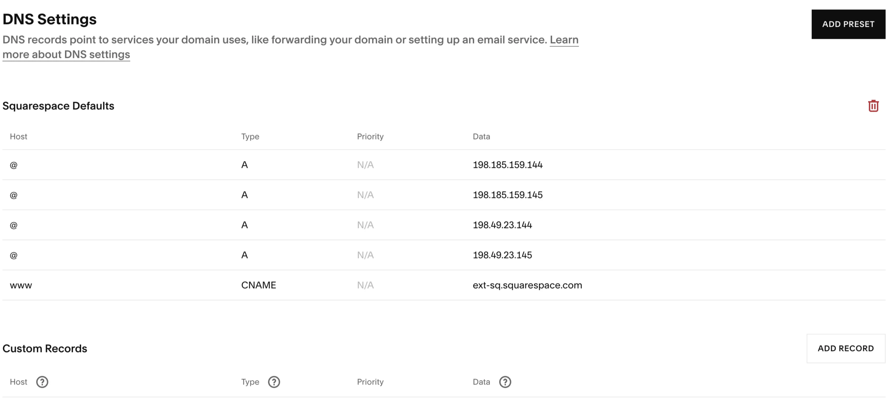
Delete the old records and add in the following new records. Make sure to replace the CNAME data with
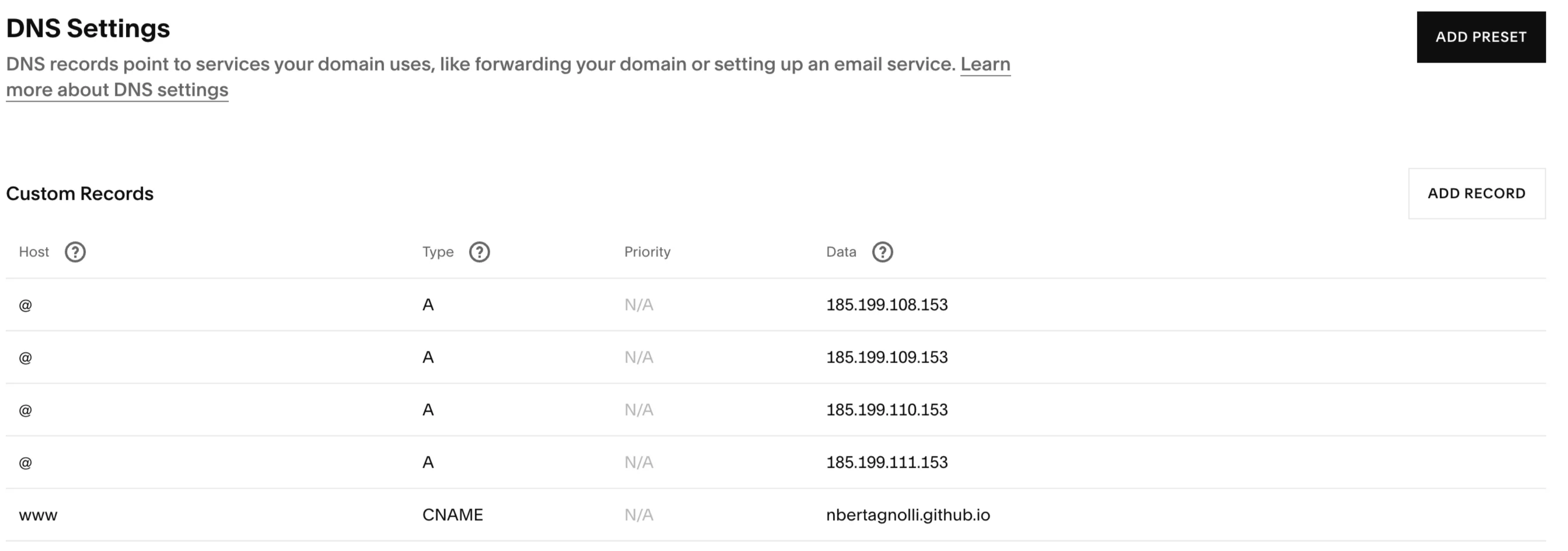
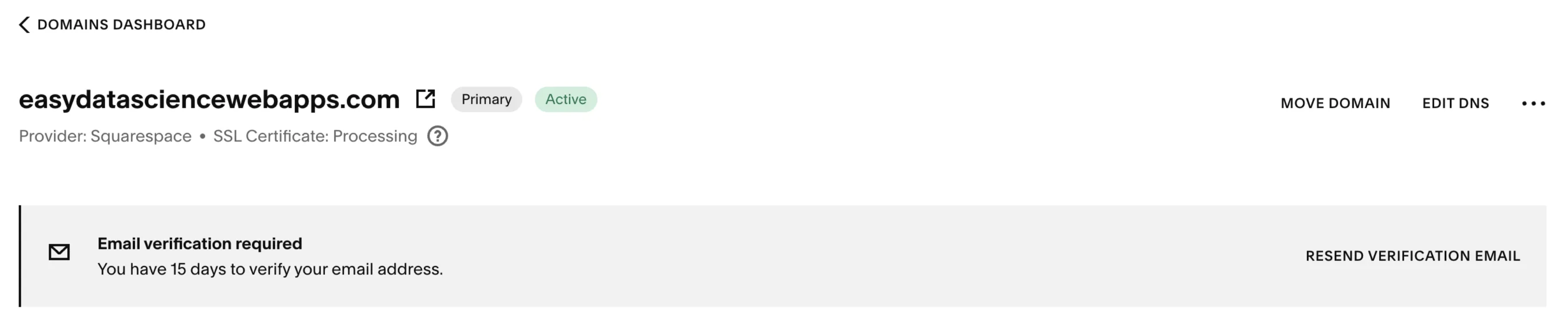
This will point everything to Github and allow us to link up our site. DNS can sometimes take some time to settle. Make sure to verify the email that SquareSpace sent and then head over to Github to finalize the address.
In the repository we created in the first part of this tutorial head to settings->pages and then add your custom domain.
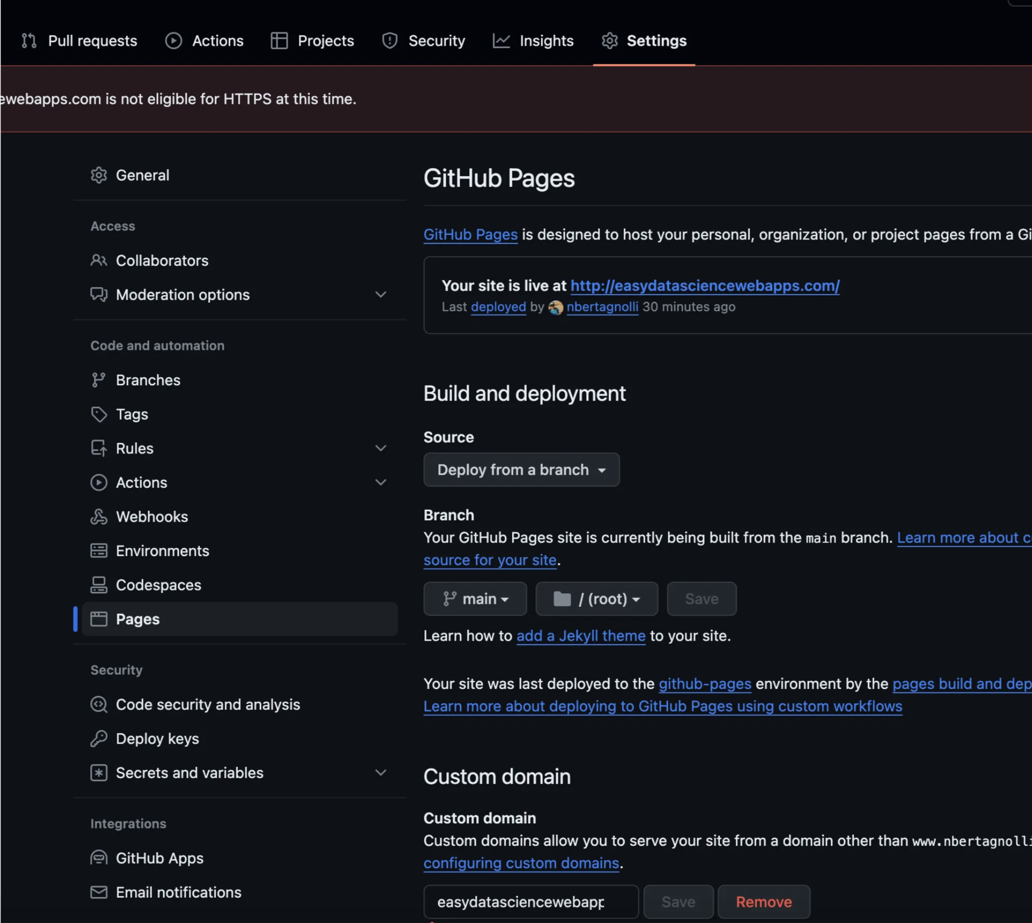
This will check that you’ve setup the correct CNAME and A records in your DNS. Once you have the green light head to the address to see the site! For me it looks like this!
Now that we’ve got our custom App up let’s make it look good! When we last left off this project we had some very basic text elements. Let’s use Tailwind CSS to prettify things!
Setting Up the HTML Structure (index.html).
The index.html file serves as the backbone of our web application. It includes references to various libraries and sets up the user interface. Before we weren’t really doing much in terms of making the site human friendly. Now, we’ll start by loading in a few libraries we’ll use to make things pretty.
Integrating Essential Libraries
<script src="https://cdn.jsdelivr.net/pyodide/v0.19.1/full/pyodide.js"></script>
<script src="https://cdn.tailwindcss.com"></script>
<script src="https://cdn.plot.ly/plotly-2.20.0.min.js" charset="utf-8"></script>
<script src="https://cdnjs.cloudflare.com/ajax/libs/flowbite/1.7.0/flowbite.min.js"></script>
These lines import Tailwind CSS for styling, Pyodide for running Python in the browser, Plotly for data visualization, and flowbite for some nice additional widgets beyond what tailwind has. These will provide a foundation that we can use to improve the way our site looks.
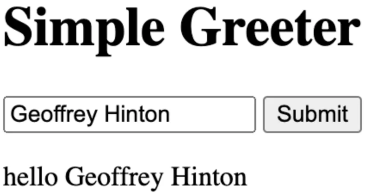
In the last post our entire HTML site was just four lines:
<h1>Simple Greeter</h1>
<input id="data-input" type="text" value="Geoffrey Hinton">
<button class="js-submt">Submit</button>
<p id="greeting"></p>
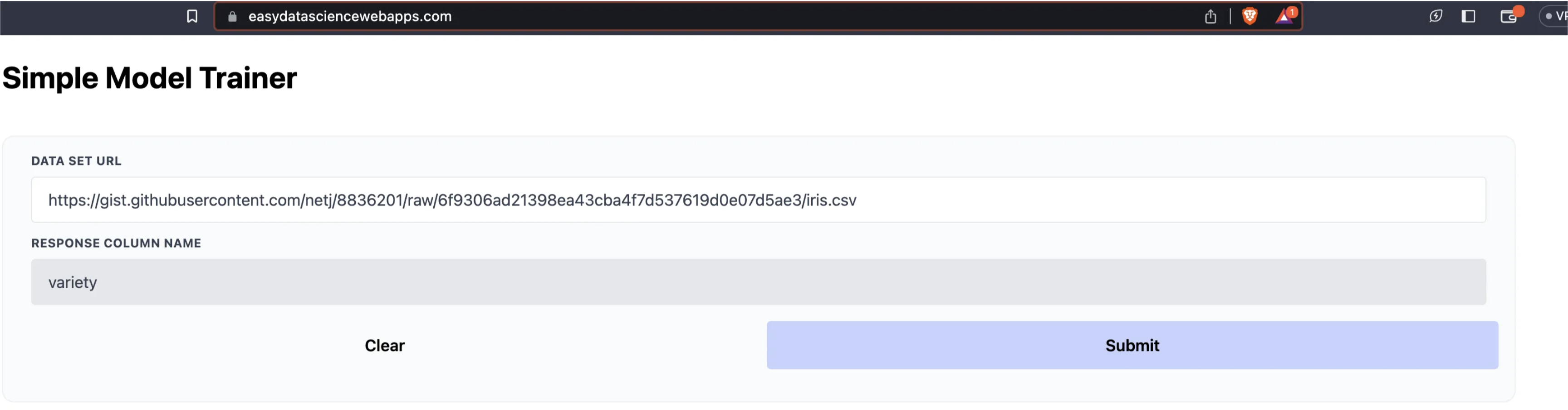
And they looked pretty poor. We’re going to use basically the same interface but with two text input boxes and a submit button. Let’s start by defining a single input field and the submit button. Let’s take a look at the full code and then walk through it in detail.
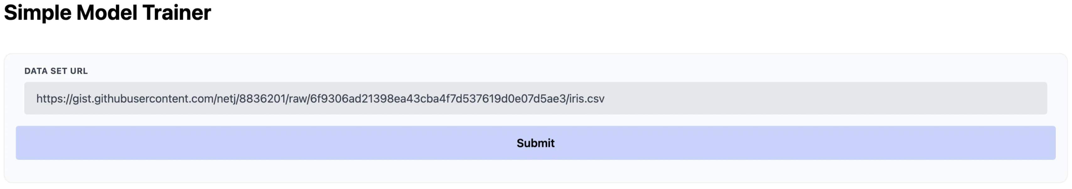
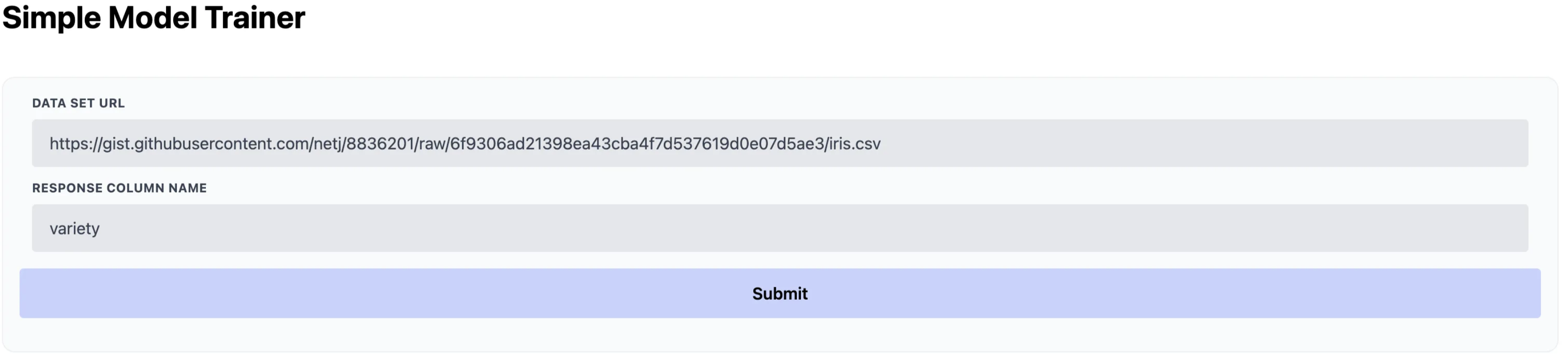
<div class="container mx-auto px-4">
    <h1 class="text-3xl mt-6 font-bold">
        Simple Model Trainer
    </h1>
    <div class="flex gap-6 mt-10">
        <div class="flex-1 bg-gray-50 p-4 rounded-xl border border-gray-200/60">
            <!-- Data Set Input-->
            <div class="w-full px-3 mb-6 md:mb-0">
                <label class="block uppercase tracking-wide text-gray-700 text-xs font-bold mb-2" for="data-set">
                    Data Set URL
                </label>
                <input
                    class="appearance-none block w-full bg-gray-200 text-gray-700 border rounded py-3 px-4 mb-3 leading-tight focus:outline-none focus:bg-white"
                    id="data-set" type="text"
                    value="https://gist.githubusercontent.com/netj/8836201/raw/6f9306ad21398ea43cba4f7d537619d0e07d5ae3/iris.csv">
            </div>
            <div class="w-full px-3 mb-6 md:mb-0">
                <label class="block uppercase tracking-wide text-gray-700 text-xs font-bold mb-2"
                    for="response-column">
                    Response Column Name
                </label>
                <input
                    class="appearance-none block w-full bg-gray-200 text-gray-700 border rounded py-3 px-4 mb-3 leading-tight focus:outline-none focus:bg-white"
                    id="response-column" type="text" value="variety">
            </div>
            <!-- Run Buttons -->
            <div class="flex gap-4 my-4">
                <button
                    class="js-submt bg-indigo-200 flex-1 p-3 rounded font-semibold focus:outline-none">Submit</button>
            </div>
        </div>
    </div>
    <!-- Holder div for the plots -->
    <div id="results-plot"></div>
</div>
1. Container Div
We start by organizing the page a bit with Divs. We create the container to hold our UI here.
<div class="container mx-auto px-4">
    ...
</div>
-
container mx-auto px-4: These are Tailwind CSS classes. -
container: Sets a max-width to the element based on the screen size and provides some padding. -
mx-auto: Centers the container in the middle of the screen horizontally. -
px-4: Adds padding on the left and right sides.
2. Heading
The first thing we put in the UI is a heading using the H1 tag
<h1 class="text-3xl mt-6 font-bold">
    Simple Model Trainer
</h1>
-
Heading (
h1) with Tailwind CSS classes: -
text-3xl: Sets the text size to 3 times the base size, making it prominent. -
mt-6: Adds margin at the top for spacing from the elements above. -
font-bold: Makes the text bold, emphasizing the heading.
3. Flex Container for Input and Button
We create another container to further organize the page letting it adjust with the layout. We embbed a flexible box inside the outer div to allow for some nice formatting of how the box looks.
<div class="flex gap-6 mt-10">
    <div class="flex-1 bg-gray-50 p-4 rounded-xl border border-gray-200/60">
    ...
  </div>
</div>
-
flex: This class activates the flexbox layout, which is a CSS layout method designed for a more efficient arrangement of elements inside a container.
-
gap-6: Creates a gap between child elements of the flex container.
-
mt-10: Adds a top margin for spacing from the heading.
-
flex-1: This makes the div flexible and allows it to grow to fill the space in the flex container.
-
bg-gray-50: Sets a very light gray background color.
-
p-4: Adds padding inside the div.
-
rounded-xl: Applies extra-large rounded corners.
-
border border-gray-200/60: Adds a border with a specific gray tone and opacity.
4. Data Set URL Input and Response Column Input
We create our first widget for user interaction with a text box.
<div class="w-full px-3 mb-6 md:mb-0">
    <label ...>Data Set URL</label>
    <input ...>
</div>
-
The
labelelement provides a text label for the input field. -
The
inputelement is where users can enter the URL of the dataset they wish to use. -
classattributes in both elements use Tailwind CSS for styling and layout adjustments.
5. Submit Button
Our second and final UI component which allows the user to submit the data and trigger the python runs.
<div class="flex gap-4 my-4">
    <button class="js-submt bg-indigo-200 flex-1 p-3 rounded font-semibold focus:outline-none">Submit</button>
</div>
-
button: An HTML element that users can click to trigger an action. -
classattributes provide styling with Tailwind CSS, such as background color (bg-indigo-200), padding, rounded corners, font weight, and focus outline behavior.
5. Plotly Place Holder
The very last little div at the end is a placeholder that we will pass to plotly when we are ready to plot our results. This holds some space for our plots and lets us graph our results.
<!-- Holder div for the plots -->
<div id="results-plot"></div>
Now our site is looking a whole lot better than it did before!
Doing the Data Science Bits
We’ve got our site looking halfway decent now! For the actual web application, we’re going to load in the iris dataset, train a model, and get some performance statistics for the model. Just like before we’ll put our code in a main.py file. This will get loaded into the web using Pyodide like we did in part one. I’ll include the whole file to start and then step through what we’re doing.
from typing import Any, Dict
import pandas as pd
from sklearn.ensemble import RandomForestRegressor, RandomForestClassifier
from sklearn.pipeline import Pipeline
from sklearn.compose import ColumnTransformer
from sklearn.preprocessing import StandardScaler, OneHotEncoder
from sklearn.metrics import classification_report, r2_score
from functools import partial
from io import StringIO


def main(data: str, response_column: str) -> Dict[str, Any]:
    df = pd.read_table(StringIO(data), sep=",")
    column_names = list(df.columns)
    print(df.head())

    columns_to_train = list(set(column_names).difference(set([response_column])))

    # Auto Determine Categorical, or continuous
    column_transformations = []
    for column in columns_to_train:
        if df.dtypes[column] == "float64":
            column_transformations.append(
                (f"scaled_{column}", StandardScaler(), [column])
            )
        else:
            column_transformations.append(
                (f"one_hot_{column}", OneHotEncoder(), [column])
            )

    ct = ColumnTransformer(column_transformations)

    # Auto determine regression or classification
    is_regression = df.dtypes[response_column] == "float64"
    model = RandomForestRegressor() if is_regression else RandomForestClassifier()

    model_pipeline = Pipeline([("data_transforms", ct), ("model", model)])

    # Train the model
    model_pipeline.fit(df[columns_to_train], df[response_column])

    # Make predictions on the training data
    preds = model_pipeline.predict(df[columns_to_train])

    # Get a classification report
    score_fn = (
        r2_score if is_regression else partial(classification_report, output_dict=True)
    )
    score = score_fn(df[response_column], preds)

    # Remove accuracy if they exist because they make the plots look bad.
    score.pop("accuracy", None)

    # Put into the format for plotly
    class_names = list(score.keys())
    print(class_names)
    score_names = list(score[class_names[0]].keys())
    results = []
    for score_name in score_names:
        if score_name != "support":
            results.append(
                {
                    "x": class_names,
                    "y": [score[label][score_name] for label in class_names],
                    "name": score_name,
                    "type": "bar",
                }
            )

    return {"scores": results}
Defining the Main Function
We define the main function which is called from JavaScript. It takes two arguments: data (the dataset in string format) and response_column (the name of the target column in the dataset). The data will be loaded in as a raw string representation of a CSV. Pandas will then parse this into a DataFrame that we can work with. We use the response_column variable to let the user determine which column we should predict.
def main(data: str, response_column: str) -> Dict[str, Any]:
    df = pd.read_table(StringIO(data), sep=",")
    column_names = list(df.columns)
    columns_to_train = list(set(column_names).difference(set([response_column])))
Preprocess Data
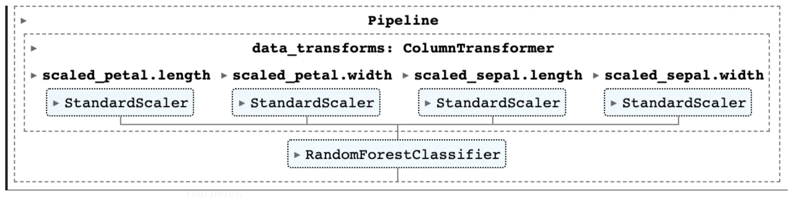
Next we use Sklearn to add transformations to the data. This code does something naively reasonable with both continuous and categorical data. It steps through each column in the DataFrame that isn’t our response and checks it’s type. For float64 columns we know that these are continuous so we standardize them. For everything else, we assume they are categorical and one-hot-encode them. We use the very helpful ColumnTransformer from Sklearn to manage the transformations of each of these columns for us.
# Auto Determine Categorical, or continuous
column_transformations = []
for column in columns_to_train:
    if df.dtypes[column] == "float64":
        column_transformations.append(
            (f"scaled_{column}", StandardScaler(), [column])
        )
    else:
        column_transformations.append(
            (f"one_hot_{column}", OneHotEncoder(), [column])
        )

ct = ColumnTransformer(column_transformations)
Prepare the Response
As we did above so we do below. We examine the output type to determine if we want to use a regression model or a classifier. We combine our column transformation and our model together into a pipeline and train the model.
# Auto determine regression or classification
is_regression = df.dtypes[response_column] == "float64"
model = RandomForestRegressor() if is_regression else RandomForestClassifier()

model_pipeline = Pipeline([("data_transforms", ct), ("model", model)])

# Train the model
model_pipeline.fit(df[columns_to_train], df[response_column])
For the Iris dataset, our model has four continuous variable inputs which all go through standardization.
Predictions
We’ve trained our model. Now we can make some predictions. Run the data through the model and then calculate precision, recall, and F1 for the training set. (I know I know we should be doing a validation set or a test set but we’re focused more on making the application than doing something real here).
The only slightly interesting thing here is creating a score function based on whether we are doing regression or classification. If regeression we just calculate r² if classification we’ll do a standard sklearn classificaiton report. Then we can just run the score_fn over the DataFrame.
# Make predictions on the training data
preds = model_pipeline.predict(df[columns_to_train])

# Get a classification report
score_fn = (
    r2_score if is_regression else partial(classification_report, output_dict=True)
)
score = score_fn(df[response_column], preds)

# Remove accuracy if they exist because they make the plots look bad.
score.pop("accuracy", None)
Plot it!
With the scores in hand we can prepare them for plotting. When working in pure python I’m a big fan of matplotlib. However, since we’re trying to create plots on the web Plotly is a great choice because it has native support in both python and JavaScript. In the following code we ignore the support of each class because it’s on a different scale than the other data and then format the performance statistics for plotting.
# Put into the format for plotly
class_names = list(score.keys())
print(class_names)
score_names = list(score[class_names[0]].keys())
results = []
for score_name in score_names:
    if score_name != "support":
        results.append(
            {
                "x": class_names,
                "y": [score[label][score_name] for label in class_names],
                "name": score_name,
                "type": "bar",
            }
        )

return {"scores": results}
Plotly JS will use this data to create a bar chart. Each dictionary in the results list represents a set of bars in the chart. x values (class names) will be used as labels on the x-axis. y values (scores for each class) determine the height of each bar. The name property will be used to differentiate between different score types in the chart legend. Since the type is "bar", Plotly knows to render these as bar plots. That’s it!
Putting it All Together
We have our python function which trains a model and makes some predictions combined with our web frontend which doesn’t look like trash anymore. We have one thing left to do which is bring them together. In this section we’ll link the “frontend” to the Python backend and finalize the project. This work is going to take place inside of the script tags. I’ll put the code in here and then walk through it.
<script type="text/javascript">
    // Setup all input fields for access.
    const divInit = document.querySelector(".js-init");
    const btnSubmt = document.querySelector(".js-submt");
    const inputDataSet = document.getElementById("data-set");
    const inputResponseColumn = document.getElementById("response-column");

    const toObject = (map = new Map) => {
        if (!(map instanceof Map)) return map
        return Object.fromEntries(Array.from(map.entries(), ([k, v]) => {
            if (v instanceof Array) {
                return [k, v.map(toObject)]
            } else if (v instanceof Map) {
                return [k, toObject(v)]
            } else {
                return [k, v]
            }
        }))
    }

    async function main() {
        const c = console;

        // Grab the python code.
        // when working locally change this to http://localhost:8000/main.py, otherwise make it the location of the raw file on github.
        const py_code = await (await fetch("https://raw.githubusercontent.com/nbertagnolli/easy-static-datascience-webapp/main/main.py")).text();
        const pyodide = await loadPyodide({
            indexURL: "https://cdn.jsdelivr.net/pyodide/v0.19.1/full/"
        });
        // Load in the packages
        await pyodide.loadPackage(["numpy", "pandas", "scikit-learn"]);

        // Load in the packages
        pyodide.runPython(py_code);

        const compute = async () => {

            // Grab all input values.
            // Pandas cannot fetch data from the internet so this must be done in JS.
            const dataSet = await (await fetch(inputDataSet.value)).text();
            const responseColumn = inputResponseColumn.value;

            // Run the modle training and evaluation
            const out = pyodide.runPython(`main(${JSON.stringify(dataSet)},${JSON.stringify(responseColumn)})`).toJs();

            // Plot the histogram results
            plot = document.getElementById('results-plot');
            Plotly.newPlot(plot, toObject(out).scores, { title: "Training Performance", font: { size: 18 }, barmode: 'group' }, { responsive: true });

        };

        btnSubmt.addEventListener("click", () => {
            compute();
        });
        btnSubmt.click();
        btnClear.addEventListener("click", () => {
            inputDataSet = "https://gist.githubusercontent.com/netj/8836201/raw/6f9306ad21398ea43cba4f7d537619d0e07d5ae3/iris.csv";
            inputResponseColumn = "variety";
            compute();
        });
        inputDataSet.focus();
    };
    main();
</script>
Get the inputs from the UI
The first step is to grab the user inputs. To do this we use the document object and query our elements by their ids and classes.
// Setup all input fields for access.
const divInit = document.querySelector(".js-init");
const btnSubmt = document.querySelector(".js-submt");
const inputDataSet = document.getElementById("data-set");
const inputResponseColumn = document.getElementById("response-column");
Setting up Pyodide
Rehashing a bit from last time, inside of our main function we need to load pyodide. We do one new thing here which is load in precompiled packages using the pyodide.loadPackage function. Pyodide has a large list of python packages that have been compiled to webassembly for use in the browser. You can find a list of all of these packages here.
// Grab the python code.
// when working locally change this to http://localhost:8000/main.py, otherwise make it the location of the raw file on github.
const py_code = await (await fetch("https://raw.githubusercontent.com/nbertagnolli/easy-static-datascience-webapp/main/main.py")).text();
const pyodide = await loadPyodide({
    indexURL: "https://cdn.jsdelivr.net/pyodide/v0.19.1/full/"
});
// Load in the packages
await pyodide.loadPackage(["numpy", "pandas", "scikit-learn"]);

// Load in the packages
pyodide.runPython(py_code);
Execute the Model
In the next section we create an async function which can call our main.py functions in the background whenever the submit button is pressed. We start by using JavaScript to fetch the raw data from the url provided in our user input. For us it’s a csv of Iris data stored on Github. Just like in our last post we use the pyodide.runPython function to call our main method with our two parameters. This will return that JSON Object we discussed in the Python section.
const compute = async () => {

    // Grab all input values.
    // Pandas cannot fetch data from the internet so this must be done in JS.
    const dataSet = await (await fetch(inputDataSet.value)).text();
    const responseColumn = inputResponseColumn.value;

    // Run the model training and evaluation.
    const out = pyodide.runPython(`main(${JSON.stringify(dataSet)},${JSON.stringify(responseColumn)})`).toJs();
    ...
};
Plot it!
Before we can plot our results we need to make sure the types align. Python dictionaries, when passed to JavaScript through Pyodide, become Map objects. However, Plotly expects standard JavaScript objects rather than Map objects. We need to convert the output from our main method to a standard JavaScript object.
To do that we define this toObject function. This function has a few pieces:
-
map.entries()returns an iterator for the key-value pairs in the map. -
Array.from()constructs an array from this iterator. -
Object.fromEntries()then transforms this array of key-value pairs into a standard JavaScript object.
We then use the if/else statements to recursively map sub objects of different types to JavaScript Objects.
const toObject = (map = new Map) => {
    if (!(map instanceof Map)) return map
    return Object.fromEntries(Array.from(map.entries(), ([k, v]) => {
        if (v instanceof Array) {
            return [k, v.map(toObject)]
        } else if (v instanceof Map) {
            return [k, toObject(v)]
        } else {
            return [k, v]
        }
    }))
}
With this function under our belt we’re ready to use Plotly. Here we first grab the div we created to hold the plot results from our HTML section. Then we convert our python output to a javascript object and add some metadata for the plot.
// Plot the histogram results
plot = document.getElementById('results-plot');
Plotly.newPlot(plot, toObject(out).scores, { title: "Training Performance", font: { size: 18 }, barmode: 'group' }, { responsive: true });
Interactivity
The last bit of this puzzle is adding a callback to our submit button so that we can rerun the model if we change the dataset. We set an EventListener for the click effect and when this happens we execute the compute function we discussed above. We also manually click the button to kick things off on page load so that the application starts running before the user does anything. The final line focuses the screen on the input data so that the user is looking in the right place.
btnSubmt.addEventListener("click", () => {
    compute();
});
btnSubmt.click();
inputDataSet.focus();
Conclusion
That’s it! Now we have a very basic application that uses Python and some machine learning libraries to train and evaluate a very simple model on some data. It then displays those results in the browser for anyone to interact with. Hopefully this project can act as a springboard for you to go build and distribute fun and useful webapps for free! Happy Building!